Resume Critiques, Resumes

Resume Critique #3: The Writer

The next in our series of resume critiques is a writer. Believe it or not, writers often struggle more than anyone else with putting together a resume; we’re the best at getting in our own way. This particular writer is UK-based, as you’ll note by the format of the contact info and the university locations, but the same general principles of good resume writing still apply. Let’s take a look at hers:

Click to enlarge each page.

What You Did Right

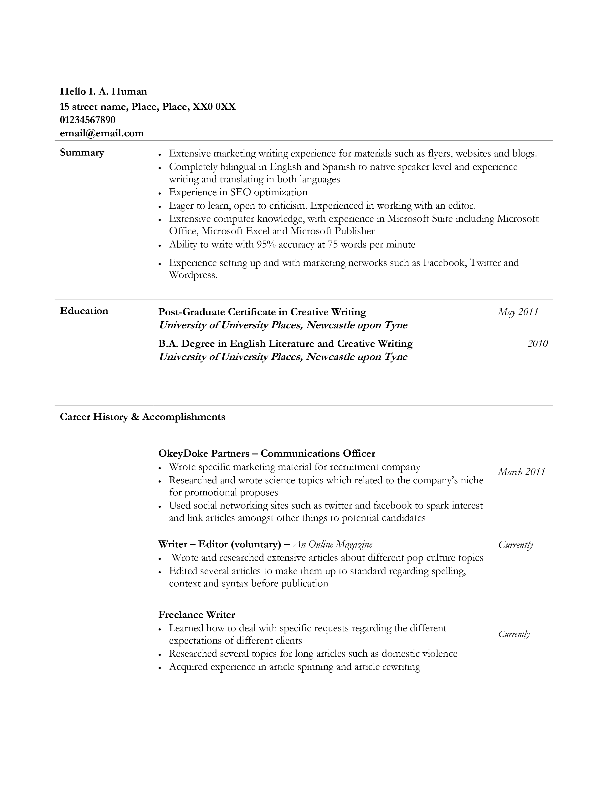
  • Opening summary. So far you’re the first of my critiques that actually included a proper opening summary. You did good, bb.
  • Two pages. You’ve kept your information short and to the point with two pages. Go you.

What You Did Wrong

  • Overly long professional summary. While it’s great that you included an opening summary and it’s mostly pretty focused on your professional career and capabilities, it’s still too long. Seven bullets, especially when some take up more than two lines? That’s too much. Instead cut it down to no more than five, each one line long.
  • Fluff in the summary. One way you can cut it is to get rid of fluff. “Eager to learn, open to criticism” has no concrete value to an employer. You’re not here to talk about your personal traits. You’re here to talk about your professional capabilities. Fill this space with things that state what you can do, not who you are or your particular character value.
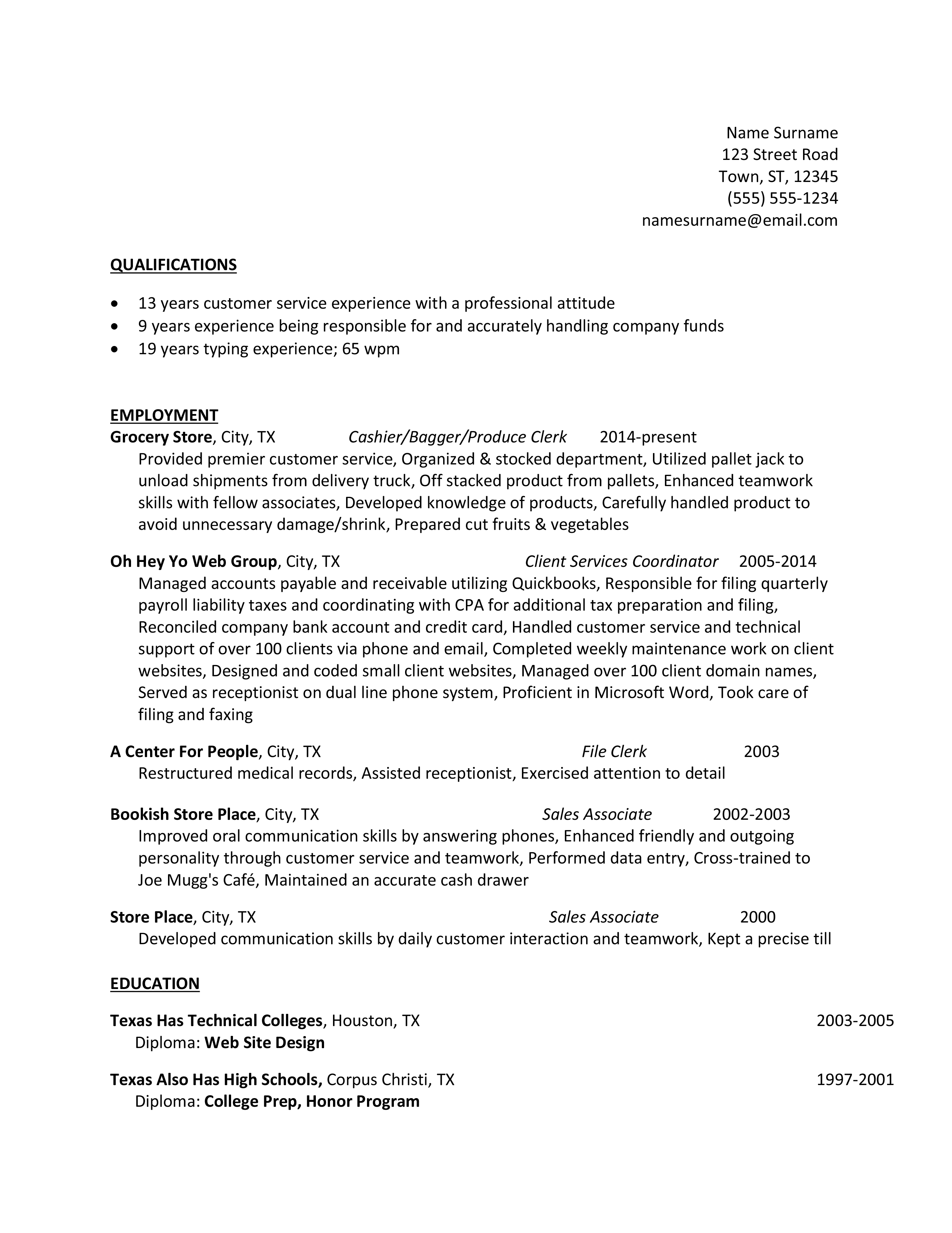
  • …oh bae. Is that a Word template? I’m pretty sure I’ve seen this format as an older Word template dating back to before that blasted Ribbon was introduced, and even if it’s not a Word template it looks like one – and that’s resume suicide. It makes you look generic, with nothing to stand out. You need a neater, more modern format that isn’t so obviously template-based or template-imitative.
  • Tiny serif font. First, don’t ever use serif fonts. They’re difficult to read in resume format. Second, serif fonts should rarely go below size 12, and this one is Garamond size 11. It’s itsy and hard to read. I had to squint at it at 120% zoom on a laptop with 1920×1080 resolution. Third, if you absolutely must use a serif font, please stick with Times New Roman. The stylizations on Garamond are subtle, but still obvious enough that the little curls make reading and information retention harder.
  • TABLES. WHY. So this is something only I can see, not readers, but this resume is formatted using tables. If you can avoid doing this, please do. Tables will break when a document is opened on various devices or platforms, and cause major problems with document flow onto the next page. Tables are poorly coded in Word and just don’t behave well. Only use them as a last-ditch necessity.
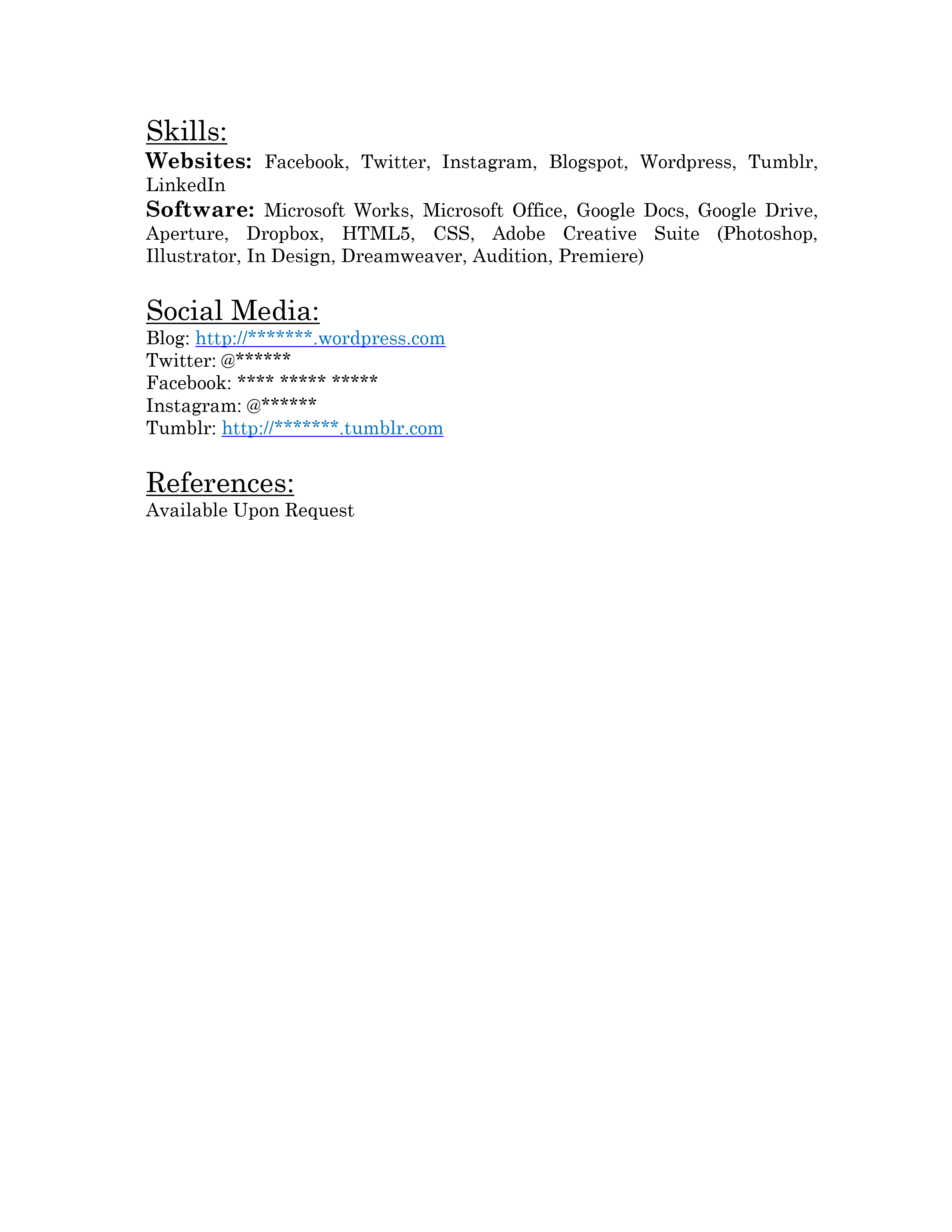
  • Where are your skills? You don’t have a searchable list of bulleted skills that will get you past automated text scanners and give you a good place to put details that don’t belong in your opening summary. Like SEO optimization, bilingual fluency, Microsoft Office suite proficiency, and typing speed/accuracy. (Honestly I’d take that 95% accuracy out of there. You’re undercutting yourself.) Move those to your skills section, then build it out with a few more strong searchable skills taken from target job applications.
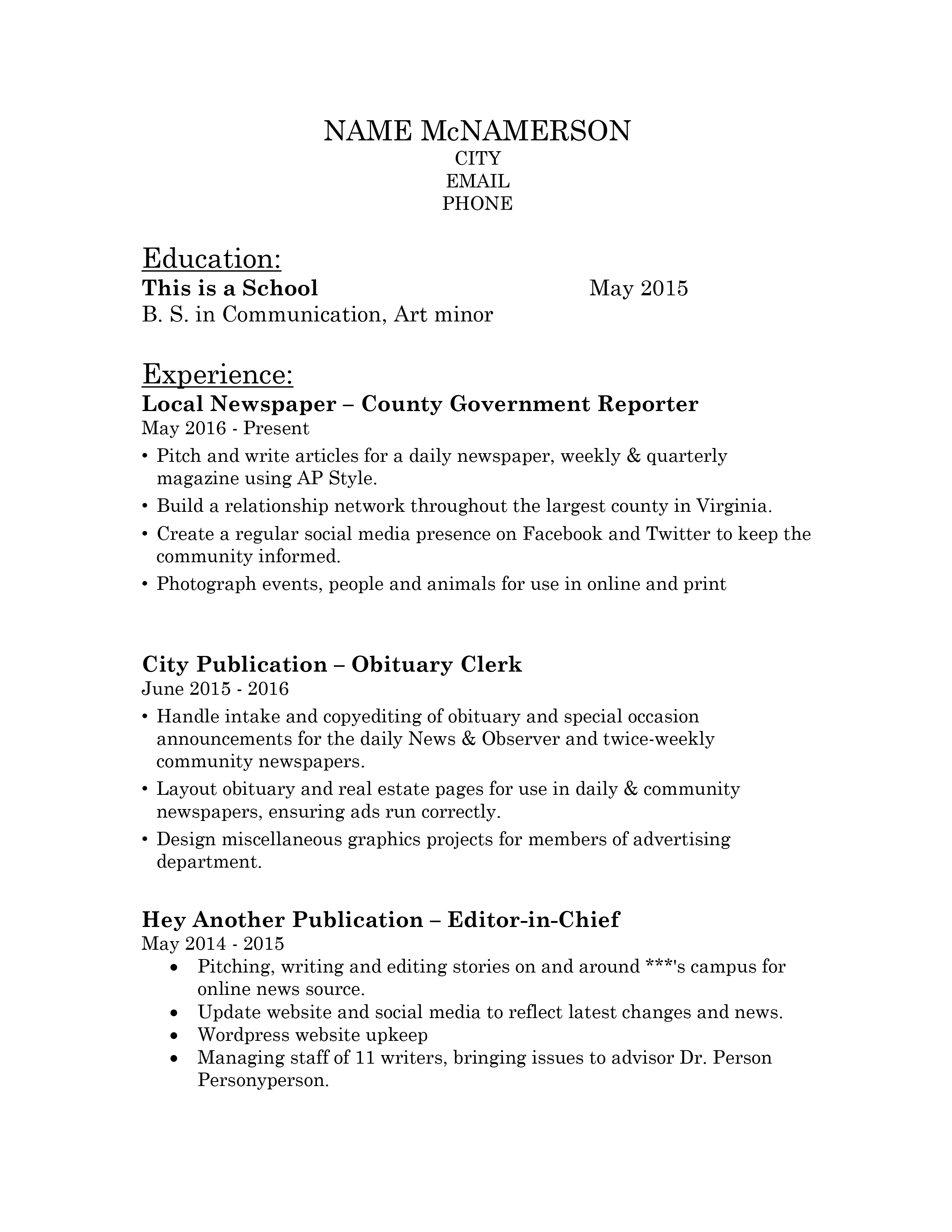
  • WHERE ARE YOUR ACHIEVEMENTS. Three people. Three critiques so far. NO ACHIEVEMENTS WHAT ARE Y’ALL DOING. *ahem* I’m sorry. I’m a little punch-drunk right now. Those achievements are the heart of your resume. You should be writing those first, and centering everything else on that.  This is the meat of your content, and what employers care about the most. Learning how to deal with client requests isn’t an achievement. Employers never want to see you bragging about learning things. Learning things is good, but it’s not an accomplishment that you had to learn how to do this rather than coming into the job fully equipped. To them that costs them money, in the time they spend paying you to learn how to be effective at your job. Instead you could say you ensured client satisfaction by adapting to challenging and constantly-changing customer requests with ingenuity.
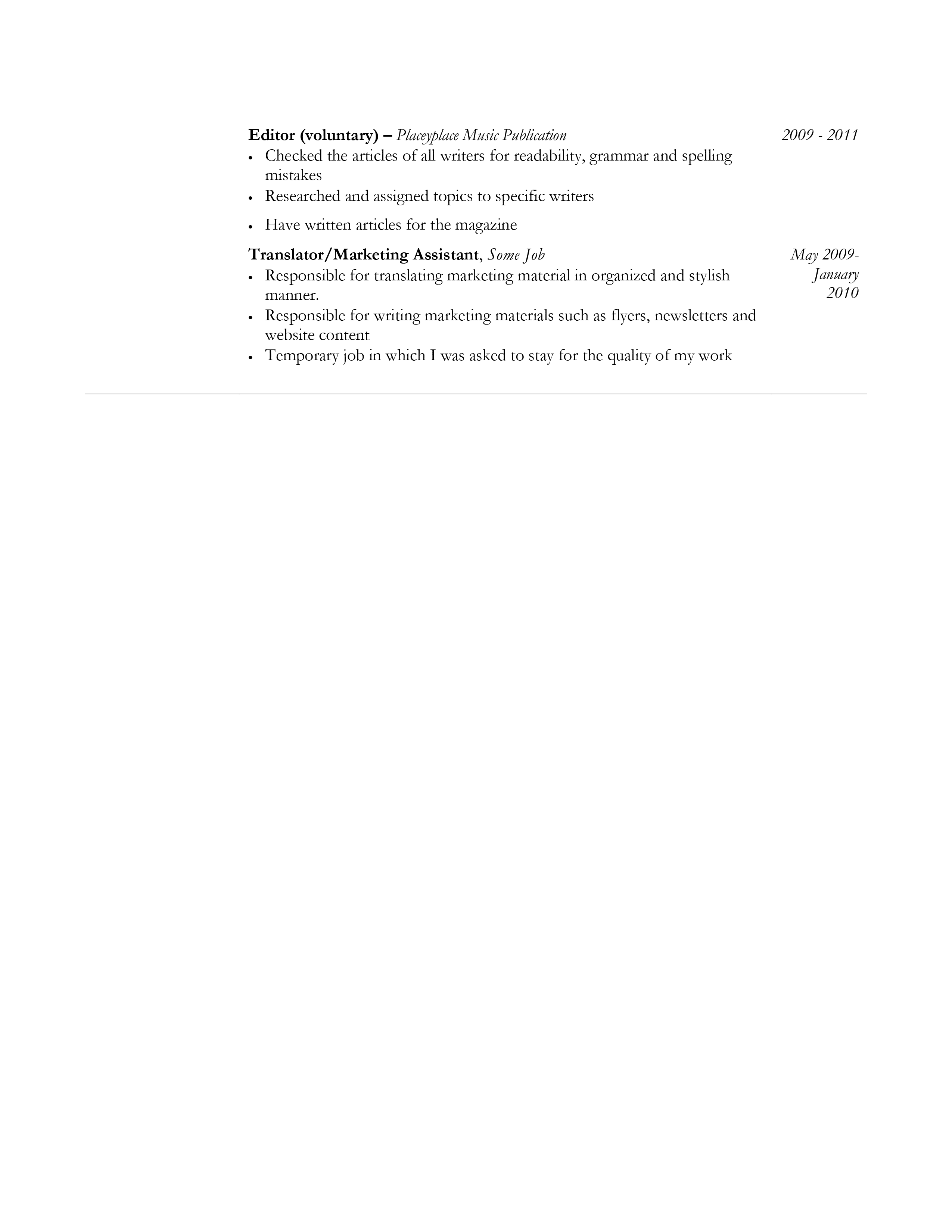
  • Grammar, spelling, and punctuation. Although I changed the street name, I left the capitalization intact; you wrote your street name in lower case. You did the same with Twitter and Facebook, writing them as “twitter” and “facebook.” Make sure to use the proper case for everything in your resume. You’re also missing some commas here and there, and I don’t just mean Oxford commas – you’re consistent in not using those, but the sentence that begins with “Use social networking” under your most recent job could use some punctuation. Also, in your role as Translator / Marketing Assistant, you slipped into first-person writing with “in which I was asked to stay for the quality of my work.” Except without that period I just added. All your bullet points save one are missing periods, and you should have them. They’re complete sentences minus the subject of “I.” You could also tighten up the writing here and there, such as changing “Have written articles for the magazine” to “Wrote articles for the magazine.” Watch out for such passive statements and clean them up.
  • Responsible for. Not only did you use the dullest no-no word in resume writing, but you used “responsible for” twice in two consecutive bullets. Eliminate all uses of “responsible” from your resume.
  • Messy and inconsistent formatting. Your date alignments are all over the place. At one job you list your job header as Company Name – Title, but at others it’s Title – Company Name, not only changing the order but also changing the use of bold vs. italics, etc.  Except the oldest one as a translator? Separates title from company with a comma, instead of the em-dashes used elsewhere. At An Online Magazine, there’s a random space before “Wrote” in your first bullet.
  • Misplaced education. I know in European CVs you generally put your education first, but a.) this isn’t really a CV, it’s more of an American-style resume, and b.) that practice is falling out of fashion. Education goes at the end. You want as much of your experience and skills on the first page as possible to catch the reader and keep them. Also drop the dates from your education. That, too, is out of fashion.
  • Dates? Chronological order? Uh? So at An Online Magazine and Freelance Writer, it just says “Currently.” …boo, when did you start? These should say “####-Present” so we know how many years you’ve been doing this. Otherwise it looks like you’re trying to hide or pad something. It also makes it look like your resume might be out of chronological order.
  • Months yes / no / WHY. No. I know some of y’all cling to the months on the CV across the pond, but stop please please pretty please. It’s not relevant. It’s extra info. It’s clutter. It’s distracting. Also if you are going to include the months, be consistent about it. You have months on two jobs, no months on one job, months on your post-graduate certificate, no months on your degree. Pick one side or the other, no in between.
  • Mention of voluntary employment. You worked at the music publication for two years. It’s valid experience. There’s no reason to call it out as voluntary; doing so immediately invalidates it as a hobby with no professional value if you mark it as volunteer work. The same for the Writer / Editor position. Don’t give people a chance to devalue it.
  • Why is that bottom border there? There’s a random border at the footer of your experience, and it needs to go. It looks like a carryover from copying other content blocks, but it also looks like sloppy formatting that will make employers think you’re careless.
  • No second page headers. Your second page should always have a header in the format YOUR NAME * PAGE 2 OF 2 * 01234567890 * EMAIL@EMAIL.COM. Never make them search for your contact info or have to go beyond one click to get in touch with you. You always want to make it as easy as possible for them to follow the impulse to contact you without even thinking.
  • You wouldn’t need second page headers if this was one page. You honestly could condense this down to one page. I like white space, but with the deep indents pushing content to the right you’re actually wasting space. Your second page overflow isn’t even a third of the page. You could easily rewrite to consolidate and give yourself a nice, neat, attractive one-page sell sheet.

I’m sorry. I got a little punch-drunk with this one, but, well, if you’ve even glimpsed the book you know this is fairly normal. But look, even if I called out a lot of problems, you still have a good core of substance. You just need to refine it to draw the diamond out of the rough, and I know you can do that.

You’re a star, baby bird. Or you’re a baby bird, I mean you could be both at once. Either way, bright thing, sky, go you, shine on. I’m pretty sure I just came close to plagiarizing the Reading Rainbow theme song, but anyway.

– Adam

Want your resume critiqued? Head here and follow the instructions.

Learn more about how to write a better resume in THE 13 WAYS YOU’RE F*CKING UP YOUR JOB SEARCH.
No one likes being called a fuckup, but I’d bet you like being a fuckup even less. Get more extensive how-to advice on cleaning up your job search game, sprucing up your resume, tackling interviews, changing career paths, discussing salary negotiations, how not to be an utter shit in the workplace, and more with 300+ pages of advice mixed with vitriol, anecdotes, and a few questionable comments that made my editor say “…seriously, Adam? Why.”
$4.99 on Amazon | Free on KindleUnlimited

Want more tips, tricks, insights, and swearing? Subscribe to Adam’s Newsletter!

Resume Critiques, Resumes

Resume Critique #2: The Clerk

Our next brave adventurer into the land of resume critiques is a clerk and cashier at an international grocery chain. Let’s take a look at his resume:

Click to enlarge.

What You Did Right

  • One-page resume. I love a good one-pager, and you accomplished this neatly with plenty of white space and no cramming. Good job.
  • Action verbs. Go you! Almost every last one of your not-quite-sentences starts with an action verb, and you vary it up pretty well.
  • Clean, easy-to-read sans serif font. For you font snobs reading: yes, it’s Calibri 11.5. Yes, that’s a good thing. Calibri is a simple, professional font with a touch of personality – and if you want to gripe about it just because it’s the Microsoft default, take the stick out of your goddamned ass and stop trying to be elitist over unimportant trash things. Yes, I love fonts. Yes, I’m also a designer. No, I wouldn’t use Calibri in a graphic design. But this isn’t a graphic design. It’s a resume, and readability trumps everything. Calibri is highly readable, so please, please stop this campaign of “I wouldn’t use it because it’s the Microsoft default” when that makes you sound like a teenager refusing to do something because the popular kids do it. (Sorry, my darling cashier. You got caught up in that little rant. You did good.)

What You Did Wrong

  • Confusing opening summary. I’m really not sure what this summary is trying to convey, or how many years of experience you actually have in total. You shouldn’t break down years of experience in individual things this way; there’s a time and a place to do that, but you don’t need it. Just show your overall career length, and focus more on concrete abilities instead of calling out these specific minutiae. Your summary should be a high-level statement pitching who you are as a professional in sum total.
  • Irrelevant information in the opening summary. Your typing experience really doesn’t matter toward your career goal unless you’re trying out for a position where that matters, such as secretary, admin assistant, or court stenographer. Even then, you wouldn’t list your years of experience typing at that speed. You’d just list your typing speed and be done with it.
  • Unclear goal. I’m not sure what you’d use this resume to apply for. Generally the summary clarifies that, but this one doesn’t. Your resume needs a clear goal, meaning you need to focus on what kind of positions you’d target and slant your resume toward that. A title often helps this, as well, instead of just labeling it “Qualifications.” If you’re not sure and just intend to keep a generic resume, I…honestly wouldn’t? Generic resumes don’t do anything for anyone. Instead let’s say you’re a cashier right now, and you’d be open to a position as cashier elsewhere but also would like to get back into a leadership role in client services. Make two resumes. One with the header title Customer Service Specialist, and one with the header title Client Services Coordinator. Write different summaries for each one, focusing on specific strengths in that target area. For the customer service resume, trim the Client Services Coordinator position down and expand on the Cashier / Bagger / Product Clerk and Sales Associate positions. For the Client Services Coordinator resume, do the opposite: put a little more meat on that File Clerk position, spruce up the Client Services Coordinator position, and cut everything else down to 1-2 lines.
  • No searchable skill keywords. You need a bullet-based list of Core Competencies or Areas of Expertise right underneath your opening summary, before your experience. This helps you pass automated text scanners by populating it with key phrases taken from target job descriptions, but it also lets employers get a quick idea of your skills at a glance. (Hint hint: you could put your typing speed in this list and focus on something more weighty in your opening summary.)
  • Large blocks of texts with no bullets. You should absolutely have some form of bullets in this resume, whether everything is bullet-based or you list your duties as a paragraph, achievements as bullets. Large blocks of text blend into this featureless wall of pointillism art that loses all meaning; people can lose their place easily, but it’s not nearly as easy to find it again. Text walls look like infodumps that no one wants to read. Bullet points help you pass the 10-second test with easy, scannable text. As an aside, there’s also a part with Oh Hey Yo Web Group where you say “Proficient in Microsoft Word.” That’s not a job duty. That’s a skill. It doesn’t belong there.
  • Use of the word “responsible.” Believe it or not, this word is a resume-killer. It’s boring and makes your work actually sound like work, instead of like something you were actively engaged in. Don’t use it. Ever.
  • Extremely long run-on paragraphs separated by commas instead of periods. Every last one of your job descriptions is a single paragraph, yet what it looks like is multiple short sentences strung together by commas, including the beginning of each clause starting with a capital letter as though it’s in sentence case. This doesn’t make sense and isn’t a typical grammatical structure, so the reader will be more focused on puzzling that out than on actually absorbing the information. Replace those commas with periods. You’re also missing a period at the end of those text blocks, so it just cuts off midair and leaves us hanging.
  • No achievements. You haven’t called out a single achievement, and you need achievements – preferably with metrics – to impress employers. They don’t want people who just showed up and did the work. They want people who made a difference. I know in certain lines of work it’s hard to really stand out because there are no opportunities, but you can find ways to at least look good on paper. For instance, you can say that you improved customer retention by continuously providing top-level service and encouraging repeat business. However, “Improved oral communication skills by answering phones” isn’t an achievement. It can actually count against you, because you’re leading off with that job at Bookish Store Place by saying “I wasn’t that great to start with, but I got better. On company time.” The same can be said for the line about enhancing teamwork skills with fellow associates; you could turn this around and instead say that you improved team collaboration and productivity by fostering teamwork. Do something similar with developing knowledge of products. Employers really don’t want to be reminded of how much they’ll have to train you, or feel that you’ll be inept until they do.
  • Bland, messy format lacking clear delineation. Your format is pretty dull and could work just as well in Notepad. I like simple, but not this simple. Your headers are so minimalistic that your job titles actually disappear. Your left alignment makes for jagged edges on the right, where your dates seem to float back and forth instead of being hard right aligned – and not just because I changed the company names, as they were pretty off-kilter even before that – and the dates on your education even seem to be breaking past the right margin. The entire thing needs some differentiation with larger font sizes for headers, a clearer structural breakdown, separator lines, justified text, bullet points. (P.S. There’s a little inconsistency there, too. You have a blank line after the headers for Qualifications and Education, but not after the header for Employment.)
  • Confusing degree listing. Your degree says “Diploma: Web Site Design.” What kind of diploma was it? Associate’s? Bachelor’s? If it was literally a diploma, write it as Diploma in Website design. Otherwise it looks like you’re trying to hide either not completing a degree, or having an Associate’s that you’re ashamed of vs. a Bachelor’s. (Protip: It’s nothing to be ashamed of. You can do a fuckton with the knowledge in a Diploma or Associate’s program, and often they’re accelerated vocational versions of Bachelor’s programs offering just as much educational growth.)
  • High school diploma in education. …bb. Why. Why. You have a completed degree and over 10 years of work history. Why is your high school diploma in here? This is only relevant for people still in high school or people looking for a job with no intention of going to college, but also no work history. There is never any other reason to include your high school diploma.
  • RTF format. Of course readers can’t see this by the image, but this file was sent to me in RTF format. If you have the capability to save it as a Word doc, do so by any means necessary. RTF is outdated and should only be a last-ditch resort.

Honestly, your information is there, it’s mostly the format and lack of achievements sabotaging you. Clean up your format with more structure. Find something nice to say about yourself. You can do this, boo boo. You can do this.

You’ve absolutely got this.

– Adam

Want your resume critiqued? Head here and follow the instructions.

Learn more about how to write a better resume in THE 13 WAYS YOU’RE F*CKING UP YOUR JOB SEARCH.
No one likes being called a fuckup, but I’d bet you like being a fuckup even less. Get more extensive how-to advice on cleaning up your job search game, sprucing up your resume, tackling interviews, changing career paths, discussing salary negotiations, how not to be an utter shit in the workplace, and more with 300+ pages of advice mixed with vitriol, anecdotes, and a few questionable comments that made my editor say “…seriously, Adam? Why.”
$4.99 on Amazon | Free on KindleUnlimited

Want more tips, tricks, insights, and swearing? Subscribe to Adam’s Newsletter!

Resume Critiques, Resumes

Resume Critique #1: The Reporter

Welcome to the very first in our series of resume critiques. Our first sacrifice is a reporter who has a great career, but doesn’t necessarily show that on paper. Here’s her resume, identifying information removed:

Click to enlarge each page.

What You Did Right

  • Simple bullet-based format. Everything is short, sweet, and to the point.
  • Use of action verbs. Each sentence begins with a strong action verb that avoids passive language. (With a few exceptions.)
  • Plenty of white space. I’m a fan of resumes that give them a lot of room to breathe, and this one has that – though that also creates a problem that we’ll get to next.

What You Did Wrong

  • Missing professional summary. You absolutely need to open your resume with a strong professional summary that covers your selling points. Instead you’ve opened with your education, which in your case isn’t necessary even though you’re a recent grad in 2015. You have enough work history, good work history, to move your education to the end and instead use that space to write a 3-line elevator pitch that gives your resume a little more life and personality.
  • No searchable keywords. You’ll never get past automated keyword scanners without a list of core competencies that also act as searchable keywords. This should be directly after your opening summary, and can be fairly short – six to nine will do just fine. You can look at job descriptions for job advertisements in your industry to get an idea of good keywords.
  • No accomplishments. This is, without a doubt, the most painful problem with this resume. You list plenty of tasks, but where are your accomplishments? Where are the individual achievements that show how you stood above the rest? You could call out feature stories you were commended for or that drove unusually high levels of traffic to the publication, or call out notable interviews you’ve done with VIPs. Instead…nothing. You absolutely must have at least one accomplishment, preferably two to three, for each job.
  • Dull format. Simplicity and cross-compatibility are absolutely important, but the format is so simple it borders on dull and looks like it could have been put together in Notepad. Use a different header font or separators to give it more structure and style.
  • Inconsistent formatting. Your bullet points vary in size and indent level throughout the resume. The dashes you use to separate your dates are sometimes hyphens, sometimes em-dashes, sometimes surrounded by spaces, sometimes not.
  • Inconsistent verb tense. Your resume should only use present tense for your current job. All other jobs should be written in past tense, but you have each of your jobs written in present.
  • Grammatical errors. You’ve got a few subtle mistakes here and there. You waver between bullet points with periods and bullet points without periods; pick one. (I prefer with periods. Without reads as robotic and stilted, to me.) You also switch from present tense to infinitive at Hey Another Publication. Your first and fourth bullets start with “Pitching, writing, and editing” and “Managing,” instead of “Pitched, wrote, and edited” and “Managed.” Your third bullet at this role breaks format and starts with a noun instead of a verb.  In your role as Staff Writer at That Publication Place, you start a bullet with “Use of” instead of “Used.” “Use of” actually isn’t a verb.
  • No consolidated date range for multiple roles at the same employer. You held four positions at That Publication Place from 2011 to 2015, but I didn’t even realize at first because they’re all listed as separate jobs and separate employers. They’re also grouped a little oddly in a way that’s confusing since you have jobs starting in 2014 listed after jobs starting in 2011 and 2013, though I get that you were listing them by end date.
  • Repetition. You have three bullets starting with some form of “pitch,” three beginning with “design,” three with “photograph,” three with “edit.” I know when what you’re doing is fairly straightforward it can be hard to find multiple verbs to describe the same thing, but when you use the same verbs over and over again it starts to become redundant and people stop really absorbing what they’re reading.
  • Months included in date ranges. This is a European practice that not even Europeans like very much anymore. It’s a distraction, clutter that invites people to try to subtract to identify career gaps, and it’s harder to get a clear idea of your range of experience. Just use Year-Year without the months.
  • Three pages. Even with the number of jobs you have, with seven years of experience you shouldn’t have a three-page resume. This is what I meant by the white space being a problem. You’re not using your space efficiently. Normally I would say with your career length you should have a one-page resume, but with 10 jobs in seven years you can get away with two. Though honestly your older experience could be consolidated to a career note, and I’d bet with a little judicious pruning you could get down to one page and avoid the repetition mentioned above.
  • Serif font. Most people have this idea that serif fonts look more dignified on the page, but they’re also harder to read on resumes because of how resumes are organized. It’s not the same as reading a book, with long blocks of text. Resumes tend to be organized in smaller segmented chunks, and the serifs on fonts such as the Century Schoolbook used in this resume make the information seem to crawl on the page. It’s harder to focus on, and harder to retain.
  • Technical Skills labeled as just “Skills.” I often argue against including a technical skills section at all. In this case it’s necessary, and you, darling reporter, were smart to include skills relevant to the work you do. However, label this section as Technical Skills so people know what they’re looking at.
  • Social media links all the way at the bottom. Your social media links should be in your contact information at the very start; at first glance I didn’t even realize they were there as I stopped reading at two pages. You should also have everything hyperlinked. Your blog and tumblr are hyperlinked, but not Twitter, Facebook, or Instagram. Facebook isn’t even your Facebook user name; it’s your name, so they have to search for you and hope Facebook’s algorithms are behaving that day. Don’t make them look you up. Include the link so they can just click.
  • No second page header. Never make anyone look for how to contact you. They should always have that information at their fingertips in the header on the page they’re reading. Not only that, but sometimes people do actually still print resumes and keep the pages filed away. If they lose the first page, they need to know who the remaining pages belong to. You should have a header at the top of the second page with NAME * PAGE 2 OF 2 * 123.456.7890 * EMAIL@EMAIL.COM.
  • References available on request. This doesn’t need to be said and it’s an unnecessary use of space. Some employers even majorly side-eye this, because it’s obvious. They know you’ll provide references on request. It’s not as though they’ll ask and you’ll say “NU. MAH REFERENCES. NO KITTY THIS IS MAH REPUTATION.” And it’s not as though they’ll assume, if you don’t say that, that you don’t have references at all. It’s normal not to include references on your resume. It’s normal to supply them on request. So cut this part as part of your quest to get down to two pages.

Overall it’s a good first effort, but it should be used as a basis to build a better resume once you’ve got the information down – not as a final resume. My intrepid reporter darling, you need to sell yourself the same way you’d sell a pitch for a story you really want to cover. Get in there and make it sharper, more metro, cleaner, more modern.

Best of luck to you.

– Adam

Want your resume critiqued? Head here and follow the instructions.

Learn more about how to write a better resume in THE 13 WAYS YOU’RE F*CKING UP YOUR JOB SEARCH.
No one likes being called a fuckup, but I’d bet you like being a fuckup even less. Get more extensive how-to advice on cleaning up your job search game, sprucing up your resume, tackling interviews, changing career paths, discussing salary negotiations, how not to be an utter shit in the workplace, and more with 300+ pages of advice mixed with vitriol, anecdotes, and a few questionable comments that made my editor say “…seriously, Adam? Why.”
$4.99 on Amazon | Free on KindleUnlimited

Want more tips, tricks, insights, and swearing? Subscribe to Adam’s Newsletter!